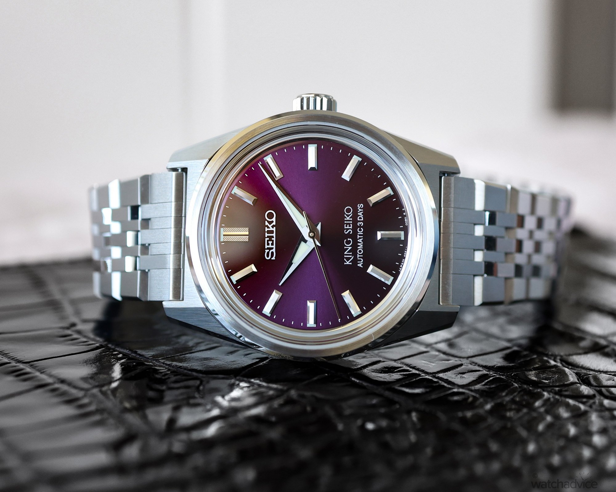
We love a watch with colour, so we were happy to go hands-on with the new King Seiko SPB461 with the burgundy “grape” coloured dial for a week.
What We Love
- The burgundy dial pops
- The bracelet’s look and feel
- Easy to wear, set, and forget watch
What We Don’t
- The size may be a little small for some wrists
- Accuracy could be greater at the price point
- Darker coloured dial adds more light reflection compared to the lighter dials
Overall Rating: 8.25/10
- Value for Money: 8/10
- Wearability: 9/10
- Design: 8/10
- Build Quality: 8/10
King Seiko in its modern form hasn’t been around all that long. Having been re-launched in 2021 as a limited-edition re-creation of an original design, it was so successful among watch enthusiasts is was then subsequently launched as a regular lineup in 2022. Interestingly, each model in the King Seiko range is based on an original model from 1965, and when you look at the design codes, style, and sizing, you can see these ’60s vibes coming through.
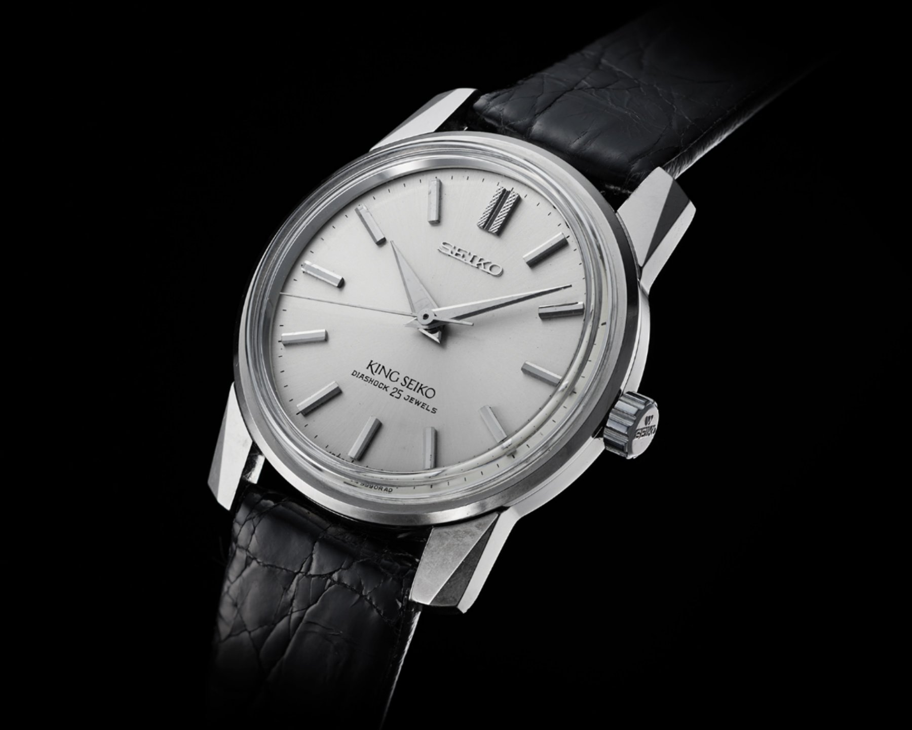
We covered a little bit of the history of King Seiko in our Hands On Review of the blue dial King Seiko KS1969 that Sameera wrote a week ago, and if you’ve not read it yet, then I suggest you check it out here. But in a nutshell, King Seiko started in 1961 when Daini Seikosha (Seiko), having concentrated on ladies pieces started to produce men’s pieces as well. Through increased production capabilities at the end of the 1950’s with the inception of the Cronos, and subsequently, two more models later that year, King Seiko was born. However, the sub-brand was short lived having been ended in the 1970s with the rise of Grand Seiko and the Quartz Crisis.
Fast forward to 2021, and for the 60th Anniversary of the first King Seiko and coincidentally, Seiko’s 140th Birthday, Seiko brought the models back as I touched on at the start – the legendary model from the 1960s King Seiko “KSK” done as a Re-creation of the original with some modern design elements. So, history lesson over, what do we think?
The Design
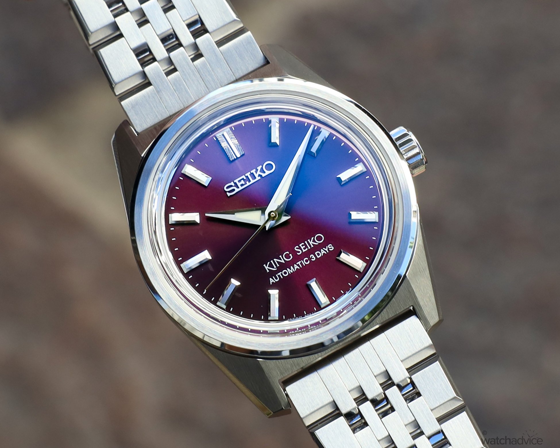
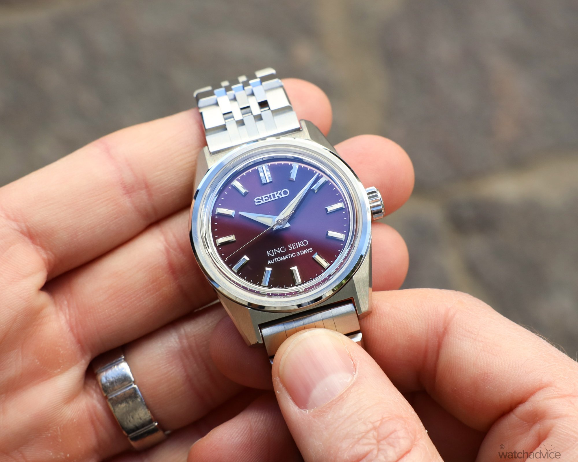
As mentioned, Seiko has taken the design of the King Seiko KSK from the design of the original in 1965, which back then was something of an anomaly for Seiko as it was one of the first watches that was done with style as the primary objective, vs the movement. Seiko has done a painstaking job of re-creating this in the modern version, especially details like the diamond knurling on the 12 o’clock marker. This, according to Seiko, is done via machine using computer numerical control, which cuts each facet into the metal one by one to produce the pattern that was part of the original.

You can also see here where Seiko has taken the 1965 design, and modernised it for today’s buyer. Seiko has kept the style of the hands with the acute angles and bevelling, but unlike the 1965 variant, this one has hands filled with Lumibrite, as are the applied indices on the dial, again, one element lacking in the ’60s version.
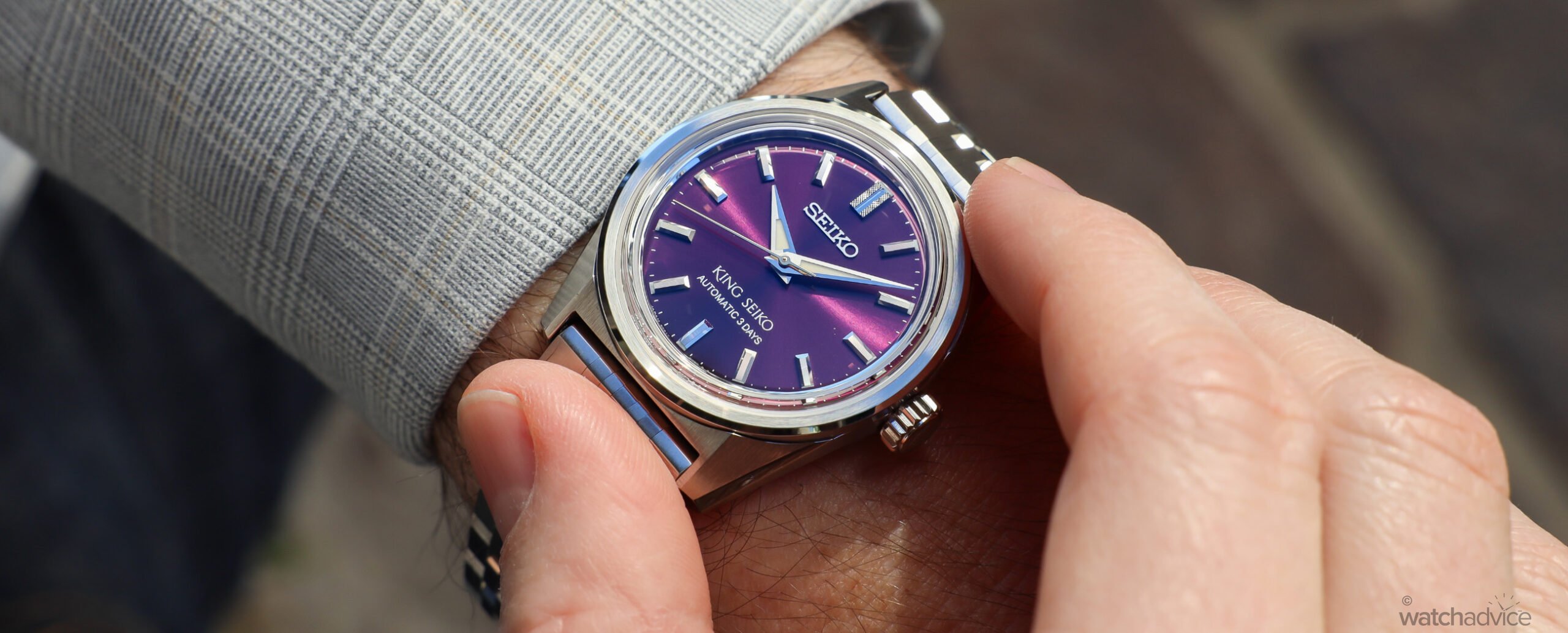
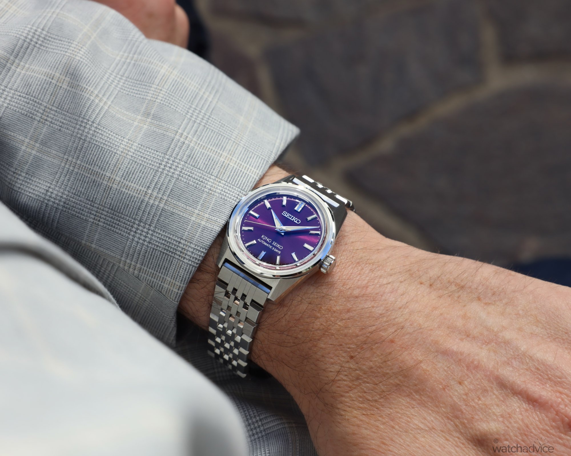
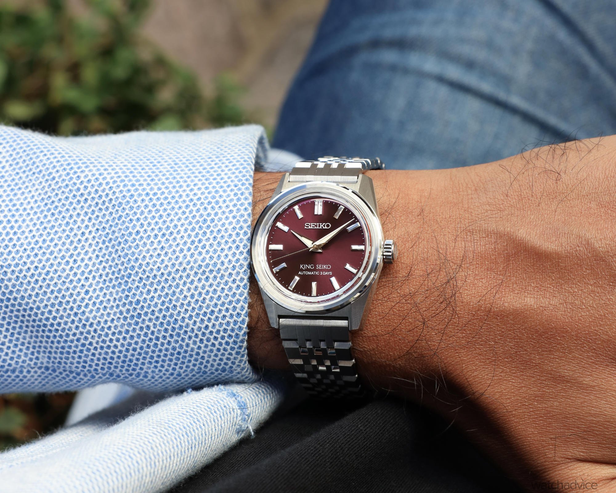
The dial on this particular version is a sunray finished burgundy, which depending on the light, can alter its shades from more a reddish colour, hence the burgundy, to somewhere between a maroon and purple – which is why we’ve nicknamed it ‘grape’ – given red grapes can range in colours like the dial. However, this colour, along with the other two colourways released is an homage to the Ivy League schools and their jerseys that are associated with them which created a fashion style you still see today: Ivy Style. Ivy style originated on the East Coast of the United States in the 1950s, (does anyone remember the school jackets in Grease?) and then adopted by Japan in the 1960s. In this instance, the burgundy used on the King Seiko is one close to a colour that was popular with Rugby shirts of the era. For those curious, the other two colours used are Ivy Green on the SPB459, a direct reference to the Ivy League schools, and a light blue on the SPB457, called saxe blue, the symbolic colour of the oxford-cloth shirts that coloured the preppy look.

Seiko has also done a great job of keeping the proportions of the case size very true to the original 1965 model, with only slight variations here. In 1965, the case was 36.7mm in diameter, with a thickness of 10.9mm, and in 2024, the KSK comes in at 36.1mm and 11.6mm thick, with a lug-to-lug of just 43mm. The thickness of the watch here is most probably due to the modern materials of a sapphire crystal not to mention the automatic movement vs the hand wound of its ancestor. The other thing to mention here is the case design, which again, Seiko has done a great job of bringing it back to life.
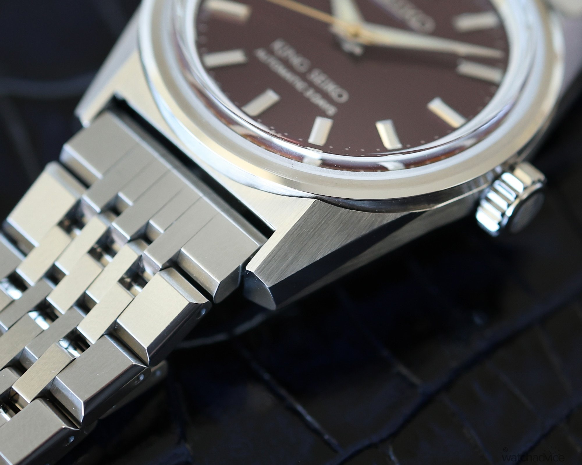
One of these is the lugs, which are brushed and polished on four different angles. If you look at the image below, you can see the different planes of the lug which are all done with a vertical brushing in line with the main edge. This is something that Seiko was insistent on keeping fairly true to the original as it was one element that stands out on the King Seiko SPB461. The one exception here: Seiko has tapered the lugs a little more, which aids with the perceived size, not to mention a slightly more modern aesthetic.

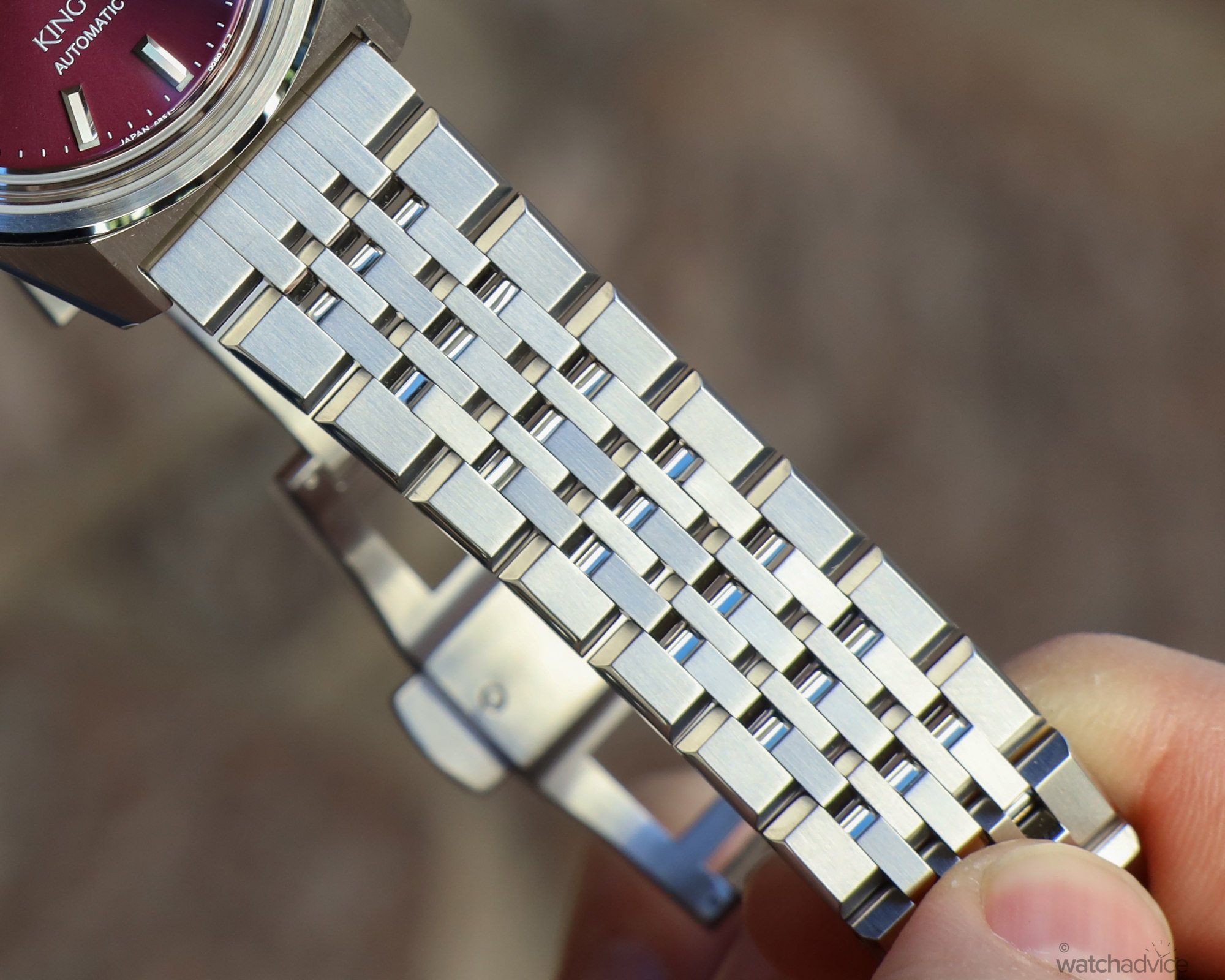
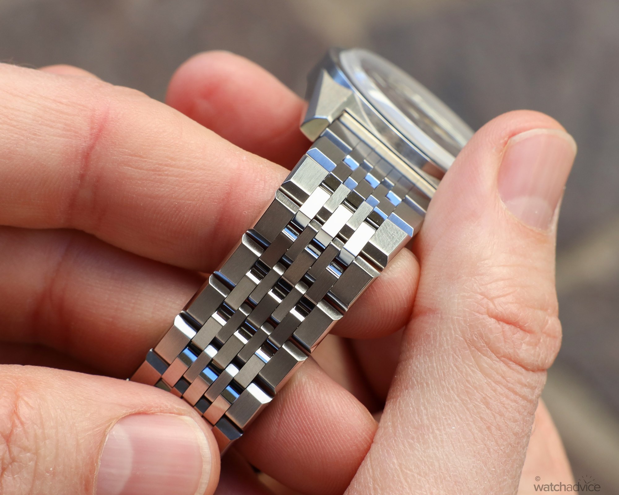
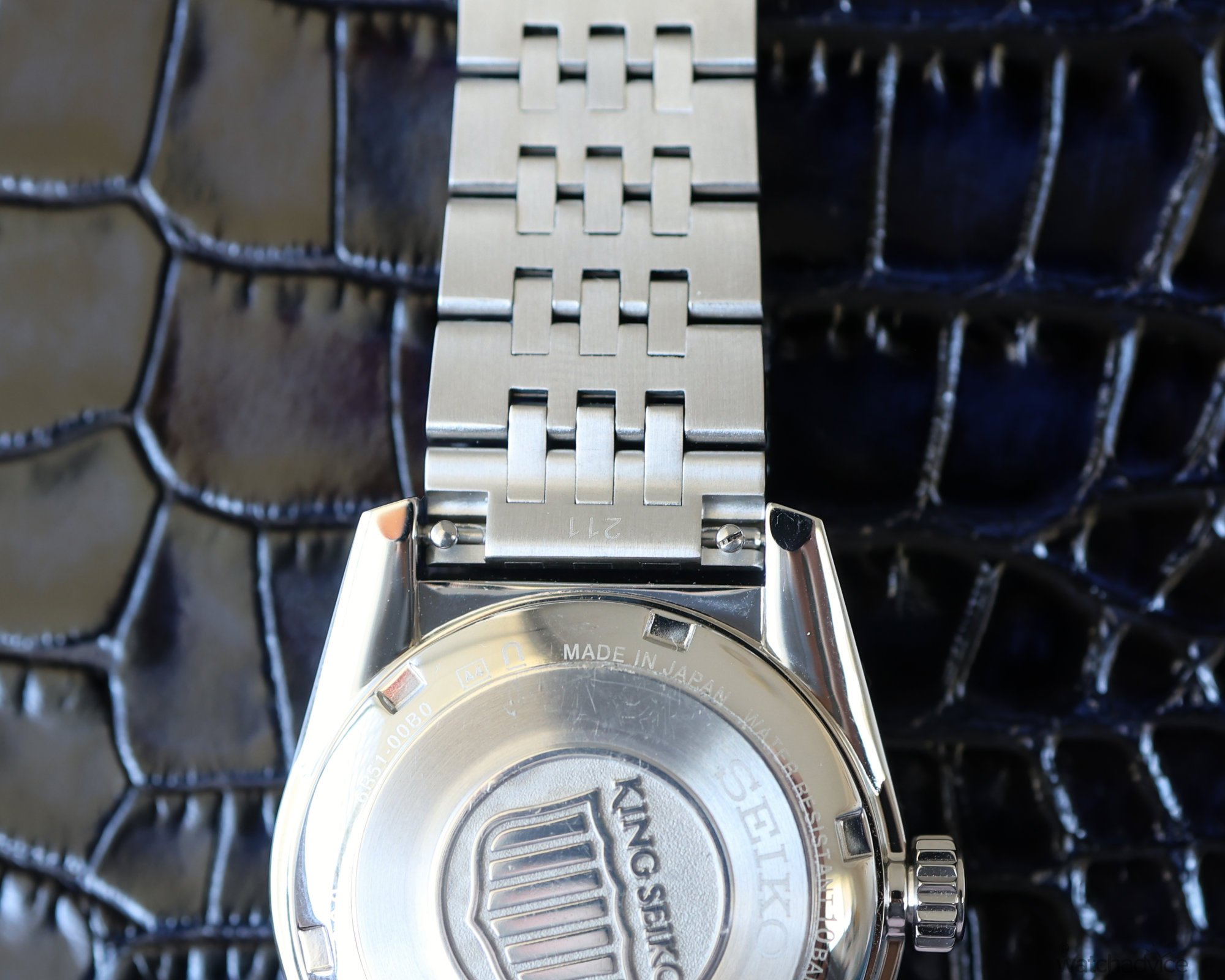
The bracelet has been done in a 7-link style, which is one element that was taken from a later King Seiko model from the ’70s. I say 7-links as this is how the bracelet is designed to look from the outside, but if you flip it over, you will see something different. More on that later. With the two thicker outer links, and then five smaller inner links, it provides the wearer with greater comfort, something I’ll talk about in the next section. Not only this, the design helps to balance the style of the watch I feel, and each link has been brushed and polished to catch the light in certain ways.


How It Wears
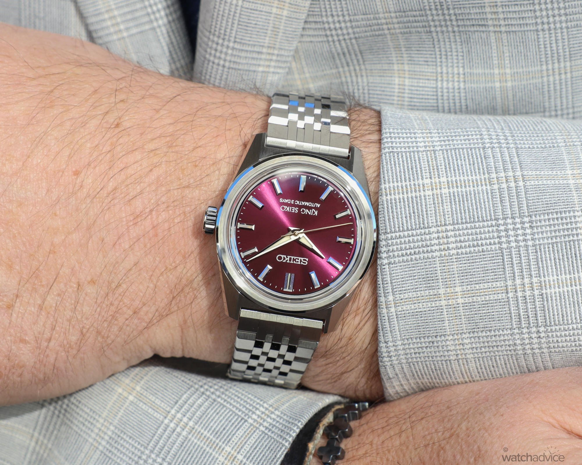
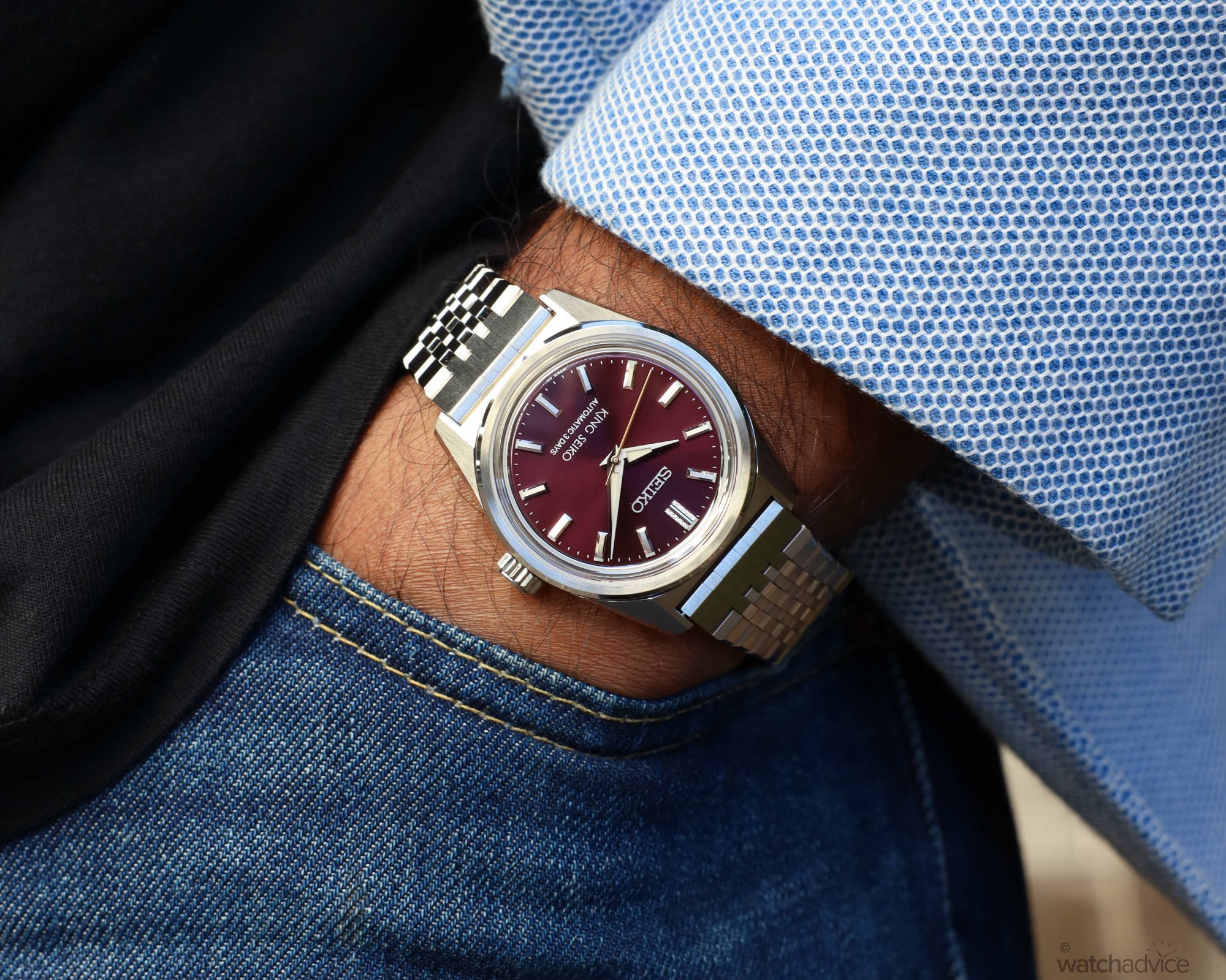
Seiko has designed the King Seiko to be an easy-wearing watch. One of the things I did love about it is what I call “Set and forget” as you can put this piece on, and then not really think about the fact you’re wearing it. Well, until you need the time, or the burgundy dial and bevelled bracelet catch your eye that is! Part of this is due to the size, coming in at 36.1mm it is by no means a large watch. While this makes it very easy to wear, personally, I felt that it looked too small on my 17.5cm wrist. I would normally wear a piece that is 40mm or more, depending on the watch I pick up that day, or what we have to review.

The other aspect that makes this piece comfortable to wear is the inside of the bracelet. Seiko has milled the inside to be flat, similar to that of a Rolex Jubilee bracelet. Not having the full shape of the links on the inside and a flat surface means the bracelet hugs the wrist better. The other part of this is, which I alluded to earlier, is Seiko has designed the bracelet to look like a 7-link on the outside, but in reality you can see on the inside it is one major link, with three joining links. This adds to the comfort, not to mention the bracelet’s ability to move and pivot based on the wearer’s wrist size and shape.

Wearing the King Seiko SPB461, you get an appreciation for the vintage styling that really shows through. The dial is easy to read, and the added modern touches, like the Lumibrite in the hands and indices makes this a highly legible watch, with the indices and hands contrasting against the burgundy dial. One small thing that I did notice is the crystal does reflect the light a little thanks to the darker dial colour, which is one small downside of having a darker dial watch with a glassbox style crystal. Now all watches have some sort of reflection depending on the light and the angle you view it from, but the crystal shape, thickness, and amount of anti-reflective coating applied, not to mention the dial colour and material will all play a part as well. This is more something to look out for generally when buying a watch.

The lugs on the SBP461 are nicely tapered down and thinned at the ends, and with a lug-to-lug of just 43mm, the King Seiko really sits flat to the wrist and the lugs gently angle down as the wrist curves, with the bracelet then falling away from the case. This keeps the King Seiko snug on the wrist, and if worn not too lose, will keep it firm in the centre, as can be seen below on Sameera’s wrist.
The Movement
Inside the heart of the King Seiko KSK beats the 6R51 Calibre. An automatic winding movement with 72 hours of power reserve, pivoting on 24 jewels and beating at 3Hz or 21,600 VpH. It is an in-house movement from Seiko, and with a claimed accuracy of -15s / + 25s per day. I feel this could be improved given the price point of the watch at A$3,000, especially when compared to other models at this price point across the wider watch world as a whole.
These days, your standard non-COSC Swiss movement will have a greater level of accuracy than this, mainly because a lot of these are based on either an ETA or Sellita and the brands will then adjust these to be within single-digit tolerances. However, the range of Swiss watches out there at a lower price point that are relatively accurate is getting smaller, primarily due to price rises over the last few years. So it is getting harder now to find anything under A$5,000 that will be COSC or close to. In most instances what I find is that the accuracy of the piece (generally speaking) is well within the numbers on paper, so expect the King Seiko to be the same.
Accuracy aside, the Seiko 6R51 is a robust movement and won’t let you down. It’s tried and tested, based on the older 6R55 having been used now for many years across different models. With the aforementioned 72 hours of power, more than some other much more expensive pieces, not to mention Seiko’s Diashock anti-shock mechanism, it is reliable and will handle most, if not all, day-to-day scenarios.
Final Thoughts
Seiko is always a good value proposition in my books, and is one reason that the brand has so many enthusiasts, collectors and communities across the world. There is a piece for almost everyone, at a range of price points, and for any occasion, plus, you can have a well-rounded collection within the brand without breaking the bank. When it comes to the new King Seiko KSK collection, it sits somewhere nicely in the middle of a sports piece, and a dress piece given the 36mm size and you can easily swap out the bracelet for a leather strap with no fuss.
The burgundy dial is different, but in a good way. It’s a nice variation to standard dial colours, in fact, the KSK collection does a great job as a whole in bringing a different take on dial colours with the Ivy-style colour palette. The burgundy is versatile enough thanks to the sunray finish and deep hue, so it works great in the evening as well as the daytime, and the bracelet finish and construction also adds to the sporty, yet more refined look. If you’re after a watch that has those classic looks, is not obtrusive in size, and as I termed it, set and forget then the King Seiko KSK SPB461 in the burgundy colour may just be the piece for you!
Reference: SPB461J – Burgundy
Specifications
- Case Size: 39.1mm, lug-to-lug of 43mm and 11.6mm thick
- Case Material: Stainless steel
- Dial: Burgundy dial with sunray finish
- Movement: Automatic winding Calibre 6R51
- Power Reserve: Approx. 72 hours
- Water Resistance: 100m (10 bar)
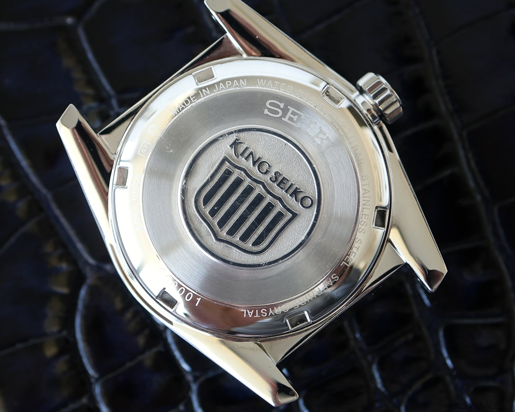
- Case back: Steel screwed case back with King Seiko relief
- Crystal: Box-shaped sapphire crystal with anti-reflective coating on the inner surface.
- Strap/Bracelet: Multi-link stainless steel bracelet with polished and brushed finishes.
Australian Recommended Retail Price: AUD $3,000
Availability: Available through Seiko Boutiques, authorised retailers or online at Seikoboutique.com.au from September 2024
Full Image Gallery
